Simon BeaumontJan 17, 20216 min readIntroducing Josh Hughes and his storyFor those of you who don't know, before I joined JLL, my previous career was dedicated to analytics in the United Kingdom's National...
Simon BeaumontAug 23, 20203 min read#IronVizLearning - Dual axis labelling with Index()Welcome to the 2nd post in my #IronVizLearning blog series, where I share what I learned during the 2020 Health and Wellbeing #IronViz...
Simon BeaumontAug 8, 20203 min read#IronVizLearning - Simplifying Your Date AxisFor the last 4 weeks the #Datafam has been busy! Busy creating 370 diverse and inspiring #IronViz visualisations as part of the 2020...
Simon BeaumontDec 12, 20194 min readAre you suffering from perfection procrastination?An honest reflection about the ongoing struggle people face with perfection procrastination and how you can overcome this within your CoE.
Simon BeaumontJun 21, 20192 min readGoing under the hoodHow many times have you seen a viz on Tableau Public and thought wow? A fair few, right? I would imagine in many instances that wow has...
Simon BeaumontMar 1, 20193 min readEnabling interactive maps through transparency, layering and imagesConfession time. This post has actually been six months in the making and the original idea came from my ‘Rainforest of the seas’ IronViz...
Simon BeaumontSep 13, 20187 min readGiving the H2O down on my IronViz submissionBefore I dive in (sorry, the first sentence and already I am up to two bad water related puns, please don’t reach for the X just yet) I...
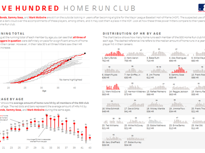
Simon BeaumontAug 3, 20188 min read100 not outThis week I hit the triple figures on Tableau Public; 100 visualisations using a platform I have quickly come to cherish. Tableau Public...
Simon BeaumontMay 11, 20183 min readCentring your highlighted jitter pointWeek 19 of Makeover Monday in 2018 challenged people to visualise the toughest sports, according to survey data conducted by ESPN. With...
Simon BeaumontMay 6, 20184 min readWaterfall charts - #SWDChallengeThe reason I enjoy participating in the Storytelling With Data Challenges is due to the simplicity of the challenge; there is no complex...
Simon BeaumontApr 11, 20184 min readBusiness <> Boring : 'Performance Pops' lollipop benchmark chartsI have lost count of the number of times I have been handed team level benchmarking analysis and the data has been visualised in the form...
Simon BeaumontApr 9, 20182 min readMargin line charts? That's what I'm calling them!On Friday 6th April 2018 I was fortunate enough to be awarded Tableau Public Viz Of The Day for my #SportsVizSunday analysis of The...
Simon BeaumontMar 22, 20182 min readBusiness <> Boring : Heat dial demand analysisWelcome to the first in a series of mini blog posts that have been inspired by Jonni Walker's recent #UKHealthTUG presentation 'Doing it...
Simon BeaumontMar 19, 20182 min readMakeoverMonday - Centred doughnut chartsIn this week’s Makeover Monday we were presented with a really small data set, 12 rows by 3 columns. With such limited data available I...
Simon BeaumontMar 11, 20183 min readHighlighted bar charts - #SWDChallengeThe March 2018 Storytelling With Data Challenge (#SWDChallenge) was a simple one; to create a basic bar chart. It is this level of...
Simon BeaumontMar 3, 20183 min readAn infographic rant and a much needed UKHealthTUG makeoverFor every UK Healthcare Tableau User Group #UKHealthTUG we try to set a data viz challenge; encouraging participants to share a...
Simon BeaumontFeb 13, 20184 min readRaising the bar - Customising Tableau bar chartsOn Monday 12th February 2018 I was fortunate enough to have my 'Need for speed' #WinterGamesViz selected as the Tableau Public Viz Of The...
Simon BeaumontJan 22, 20182 min readGame. Tableau Set. and MatchOn January 1st 2018, Phil ‘The Power’ Taylor retired from the Professional Darts Corporation, ending a career that spanned over 30 years...
Simon BeaumontJan 14, 20184 min readAnnotated line charts - #SWDChallengeIn January 2018 Cole Knaflic started a new, monthly, Story Telling With Data challenge for 2018. January's challenge was to create an...
Simon BeaumontJan 14, 20186 min readWhen less isn't always moreSo often we are told less is more; keep it simple; white space is good. These are all statements I completely agree with, however when...