Tableau top tip : Non-scaffolding date trick
- Simon Beaumont

- May 12, 2020
- 3 min read
Let me set the scene. You are creating a time series analysis, analysing sales by month year and for some of your metrics your data starts in February 2019, some in March 2019 and the data has months ranging up to August 2019, September 2019 and October 2019. In short, scaffolding hell, you have incomplete data but you want your time series, monthly trend charts, to show every month in 2019.

Well there is an alternative, but before I share the non-scaffolding approach, let me be clear, scaffolding remains the most robust solution and there are some great blog posts out there that explain how to scaffold effectively…. my favourite one being from the daring duo, Ken and Kevin Flerlage.
So, we have set the scene and we understand the challenge we face, now let us explore the non-scaffolding solution.
To simplify the technique walkthrough, I will refer to a Year parameter that specifies the period I wish to scaffold with an All option that would show all of the data range, in this scenario 2018 through today. Alternatively, you could easily replace this with a table calculation if you wished to avoid a year drop down and instead do it via normal date range filters.

First drop your date field as a continuous pill, with a month year grain onto your columns shelf. A continuous pill is critical for this trick to work, you will see why at the end.

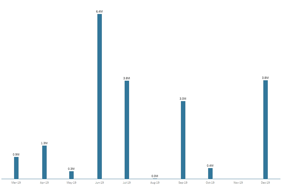
Place your measure value onto rows and set your chart type as a bar. Depending on the months within your data set you will see something that resembles the example below, yes the chart relates to your chosen year but not every month is showing.
To resolve this challenge of the incomplete year showing, first create a calculation that specifies the minimum period you wish to show, i.e. the starting month of the chart:

Next create a calculation that specifies the maximum period you wish to show, i.e. the end month of the chart:

Before we move on let us understand what these calculations are doing. We know we wish to show the full calendar year, i.e. January through to December. As such the Month Min calculation creates a date value by converting a string relating to the 1st of January of the year you wish to present, with the All option creating a date of 01/01/2018.
The Month Max calculation create a similar date value but this time with the value of the 1st of December, and where the parameter is set to All the current calendar year is parsed into the string before being converted into a date field.
Drop both the Month Min and Month Max fields onto the Detail Marks Card as a continuous exact date pill.

Now you need to put these 2 pills onto your chart. First drop a Constant Line onto the Month continuous date shelf. It will default to the 1st of the month of the actual data being visualised. Right click on the constant line and apply the following settings:
Value change from Constant to Minimum
Apply the value of Month Min
Set Label, Tooltip, Line, Fill Above and Fill Below to None. By doing this we are effectively making the constant line invisible so it will not show on your chart.
Untick ‘Show Recalculated Line’ and click OK.
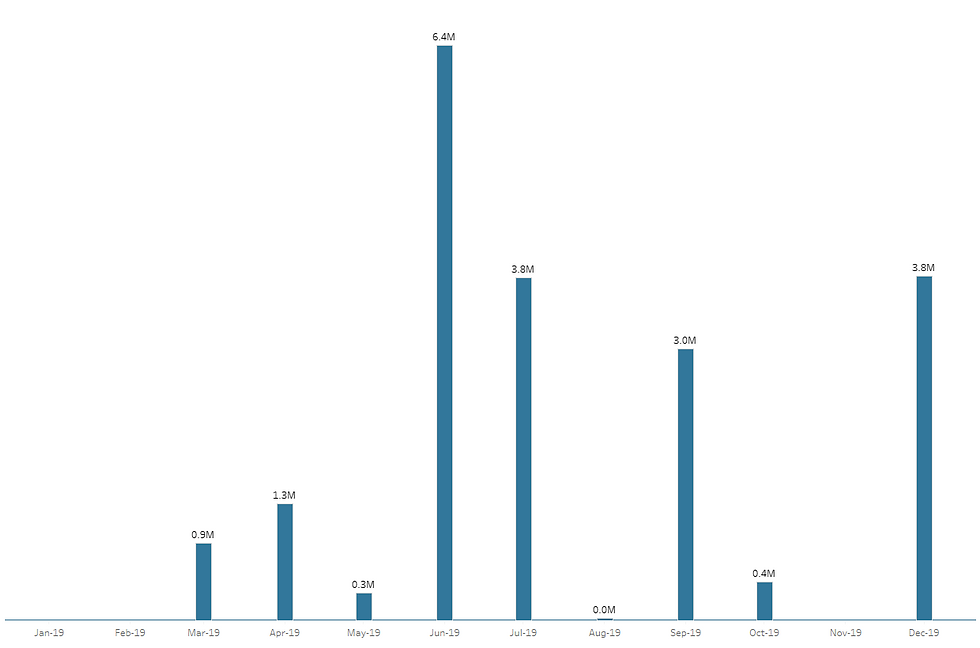
You will notice the start of your date axis has now changed to show 01/01/2019.
Repeat these steps but instead of dropping Month Min onto the 2nd constant line, use Month Max. Just as the start of your date axis changed to 01/01/2019, the end of your date axis should now show 01/12/2019. Hey presto the full calendar year.

To be clear, this technique is not creating any missing months in Tableau. It is simply giving the illusion of a complete year by forcing your date axis to range from January to December. By setting the date axis to a continuous pill, Tableau visualises every month without needing an actual data point to visualise.
Hopefully this solution will be of value to you if you want a light touch way of populating missing months on a chart. Properly scaffolding your data is without doubt the best way of doing it, but if your scaffolding need only relates to a time series chart, this technique may well save you some time and some data architecture effort.


Comments